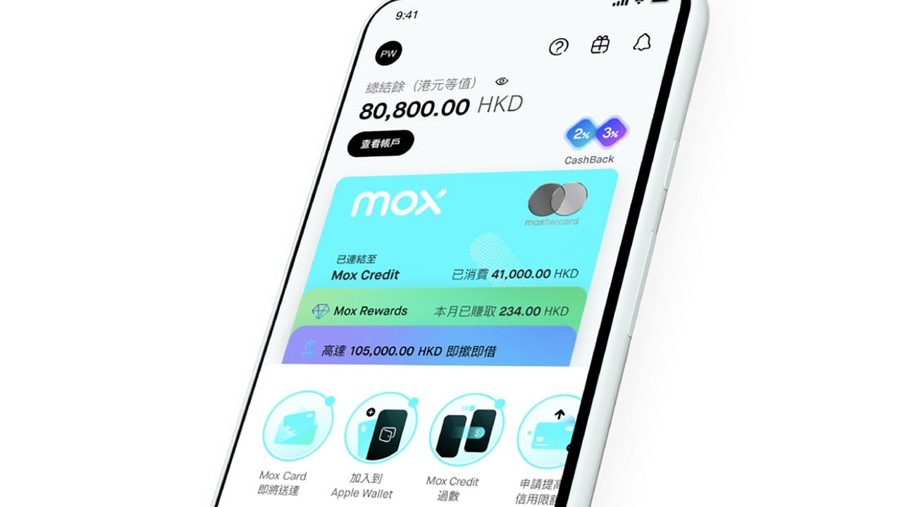
Every time a study crowns the "best" banking apps in Asia-Pacific—putting names like Mox, BOCHK, ZA Bank, and Citibank on a pedestal—the industry pops champagne. Consumers nod along. Executives put badges in pitch decks.
It is theater. Pure, polished theater. Also making news recently: Why West Kowloon’s Billion-Dollar Deficit Is Actually Proof the Model Works.
The lazy consensus assumes that a high-scoring mobile app equals a superior bank. Better navigation, snappier biometric login, brighter charts, fewer taps to move cash. Check those boxes, win a trophy, attract eyeballs.
That logic falls apart the moment money actually matters. Further details on this are explored by The Economist.
I have watched financial institutions burn millions chasing app awards while ignoring the plumbing underneath. Glossy UIs do not fix frozen accounts at midnight. A five-star rating on a budget tracker does not save a cross-border wire from getting stuck in compliance limbo for four days. App store stars measure friction during sunny days. Real banking gets tested during storms.
The Award Illusion in Mobile Banking
Most banking app rankings reward surface-level polish. Testers click through onboarding flows, check feature checklists, rate visual hierarchy, and time how fast a user can check a balance.
That methodology mistakes a storefront window for the warehouse.
In retail banking—especially across dense, fast-moving hubs like Hong Kong and Singapore—competition looks fierce on screen. Virtual banks like Mox and ZA Bank arrived with sleek interfaces, instant account opening, and aggressive promotional rates designed to pull customers away from legacy giants. Meanwhile, incumbents like BOCHK and Citibank poured massive budgets into mobile overhauls so they would not look like dinosaurs next to digital-first challengers.
When a study groups virtual disruptors and global incumbents together in a top-ten list, it creates a false equivalence. A shiny mobile wrapper on top of an old core ledger behaves very differently under stress than a cloud-native ledger built from scratch. Conversely, a slick virtual bank with thin product depth or shifting promotional yield can feel great for daily coffee runs while falling short for complex household finances or long-term credit lines.
Rating an app in isolation is like rating a car stereo while ignoring the brakes.
Imagine a scenario where a traveler lands in Tokyo on a Friday evening, needs a large emergency payment cleared before a vendor locks a booking, and hits an automated fraud hold. A clean home screen cannot talk to a human underwriter at 11 p.m. A clever spending donut chart cannot override a rigid daily transfer cap. Yet studies routinely score those neat visual touches right alongside core reliability.
Asking the Wrong Question About "Best" Apps
People searching for the best banking apps usually start with the wrong premise. They ask, "Which app has the best features?" instead of asking, "Which institution protects my liquidity and time when something goes wrong?"
Feature bloat is not a virtue. Half the tools inside modern banking apps—carbon trackers, automated round-ups, AI chat widgets that loop through canned scripts—exist to boost engagement metrics, not customer outcomes. Engagement is a metric for social media and mobile games. For a bank, low-friction utility and rock-solid execution beat endless screen time every single day.
Consider the questions people routinely type into search bars around these rankings:
- "Are virtual banks safer than traditional banks?" Safety in banking is not a vibe; it is a legal and balance-sheet structure. Deposit insurance schemes, capital buffers, risk management, and operational resilience determine safety—not whether a bank has branches or operates purely via smartphone. Calling one inherently "safer" or "riskier" based on app delivery misses how deposit protection and institutional backing actually work.
- "Why do traditional banks still make top lists alongside digital banks?" Scale, ecosystem reach, multi-currency rails, wealth integration, and institutional trust. A legacy bank may have heavier legacy baggage in spots, yet it often commands deep liquidity, broad payment connectivity, and established credit infrastructure that a younger digital bank is still building out.
- "Should I switch my primary bank based on an app ranking?" Switching your primary financial hub for a top-ten badge is a rookie mistake. Moving salary direct deposits, recurring bills, tax records, and credit relationships carries real operational cost. An app ranking is a data point on interface usability, not a mandate to uproot your financial life.
What Actually Separates Great Banks From Good Interfaces
Real banking quality lives in four unglamorous areas that rarely get enough weight in flashy awards:
- Exception Handling: Anyone can build a smooth path when a transfer is small, domestic, and routine. Great institutions shine when a payment is flagged, a card is lost abroad, or a document needs verification. Speed of resolution beats clever animations.
- Product Depth vs. Gimmickry: A high-yield promo rate for three months is marketing. Consistent pricing, transparent fee schedules, clear FX spreads, and dependable credit or multi-currency tools build lasting value.
- System Uptime and Settlement Reliability: Downtime during peak market hours or payday spikes hurts far more than an outdated icon. Stability under load is engineering discipline, not marketing copy.
- Clear Guardrails: Good banks explain limits plainly before you hit a wall. Bad ones surprise you mid-transaction with opaque holds and dead-end support queues.
Industry observers from the Basel Committee on Banking Supervision to seasoned payments architects have hammered on operational resilience for years for a reason. Technology is only as trustworthy as the controls, risk systems, and recovery processes behind it.
Where My Contrarian Stance Can Bite You
Being skeptical of app awards carries its own blind spots, and I will own them straight up.
If you treat interface design as irrelevant, you can end up trapped in clunky workflows that waste hours every month. Clunky UX often signals deeper organizational friction—teams that do not talk to one another, slow product cycles, or brittle customer journeys. A great interface does not guarantee a great bank, but terrible UX frequently correlates with headaches elsewhere.
Also, dismissing digital challengers because they lack decades of history ignores how fast software-native banks can iterate. Lower branch overhead and modern architecture can let digital players ship fixes and features faster than sprawling incumbents. The smart move is not picking a tribal side; it is testing both interface quality and operational backbone.
How to Pick a Bank Without Falling for Hype
Stop reading top-ten lists as verdicts. Treat them as a rough shortlist of apps that do not embarrass themselves on basic usability—and then run your own stress test.
- Audit your actual money flows: Map where your cash sits, where it leaves, and in which currencies. An app built for casual domestic spending is not the same tool as an account handling international transfers or larger reserves.
- Test support before you need it: Check real hours, escalation paths, and how issues get resolved when automated prompts fail.
- Watch the fine print on rates and FX: Look past headline numbers to see ongoing rates, caps, and conversion spreads once introductory perks fade.
- Keep a backup rail: Relying on a single app or single institution—no matter how high it ranked this year—creates unnecessary single-point-of-failure risk.
Rankings sell clicks and validate marketing budgets. Your money needs reliability, clarity, and resilience when things go sideways—not another shiny badge on a home screen.